
Book People
A comprehensive rebranding project for an independent bookstore
Project Summary
A conceptual identity refresh for Book People, Austin's iconic independent bookstore, designed to reflect its welcoming, community spirit and love of reading, unifying its visual & storytelling presence across every platform.
Research and Discovery

My research began with uncovering what makes Book People a true Austin treasure. It's far more than a bookstore! It's a cultural landmark, home to two floors of books, a cozy coffee shop, and a curated mix of local gifts, creating a lively and genuine atmosphere.
Through observation and market research, key insights emerged: customers valued authenticity, community connection, and a cozy atmosphere that larger retailers couldn't replicate. The new identity needed to celebrate that sense of pride and belonging while bridging the gap between tradition and modernity, creating a timeless, cohesive system that speaks to both digital natives and lifelong readers.
In essence, the brand needed to feel as authentic, inviting, and proudly local as the experience of stepping inside Book People itself.
Mood Board and Type Research


Sketches
Creative Challenge
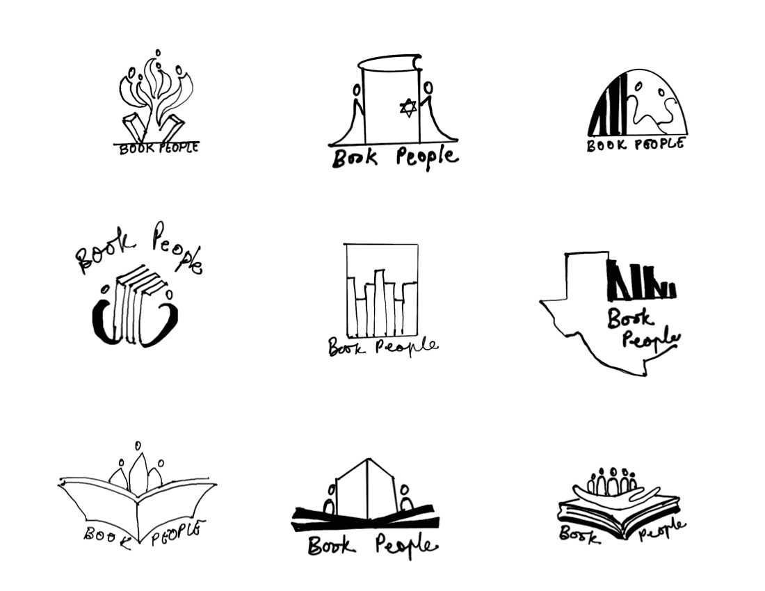
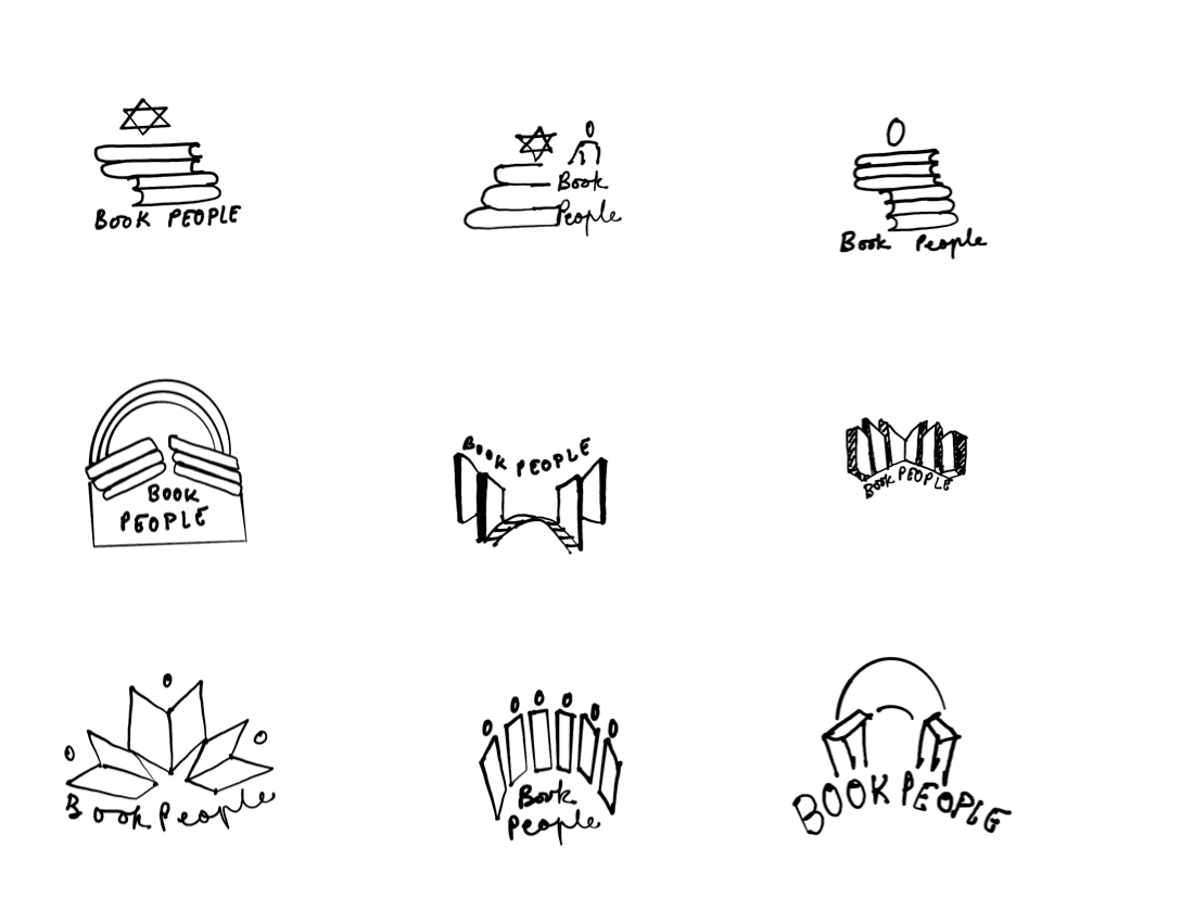
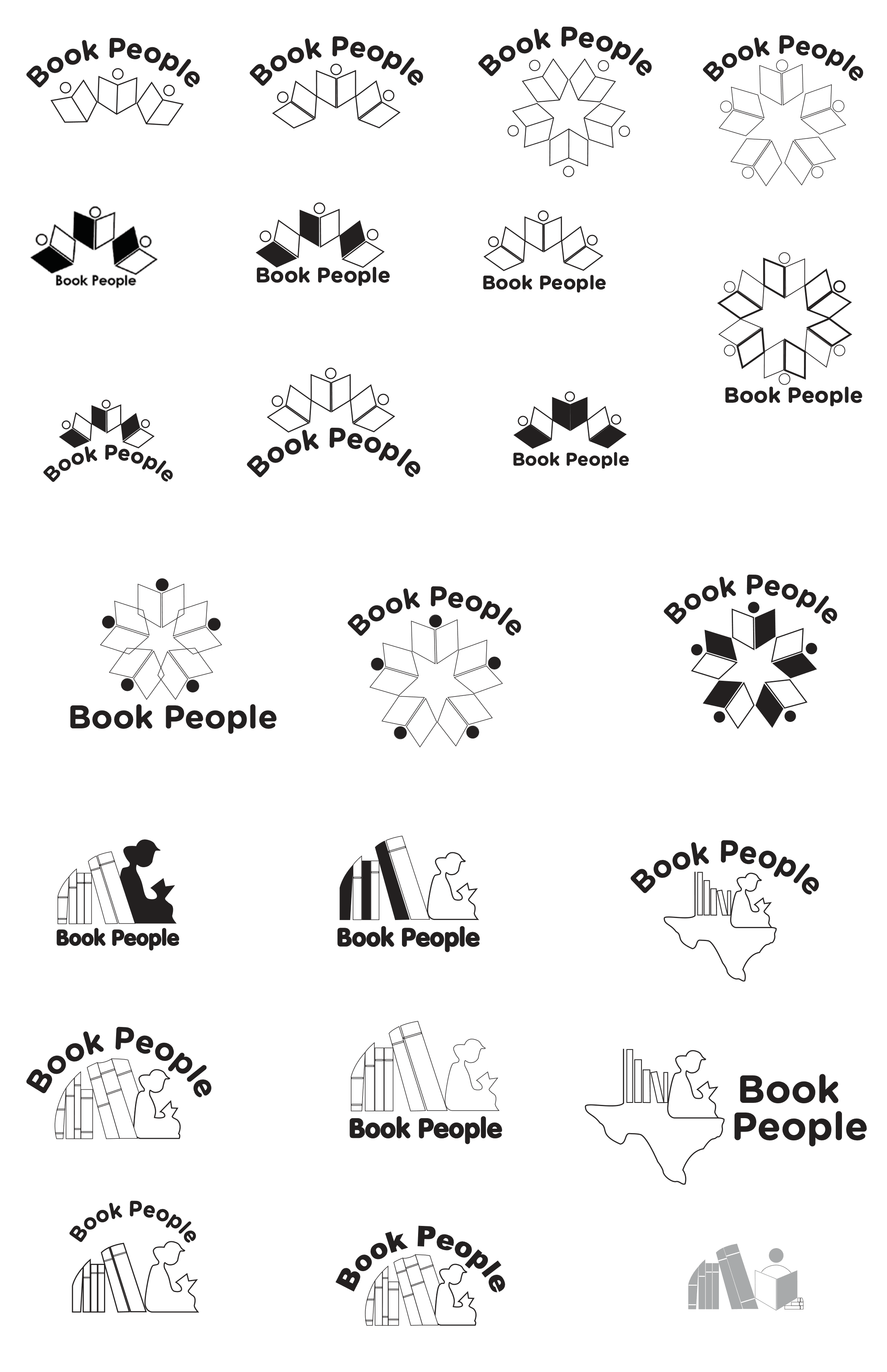
A key creative challenge was turning the idea of community and books into a simple, memorable logo that feels welcoming to everyone. It was also important to blend in the local Texas spirit, so the design needed to reflect Book People's unique bond with its neighborhood. Achieving both warmth and a strong local vibe, while ensuring the design worked effectively in monochrome and at smaller sizes also demanded careful exploration of layout and shape.
Digital Sketches
Final Design

Logo Variations

Brand Applications


Project Reflections
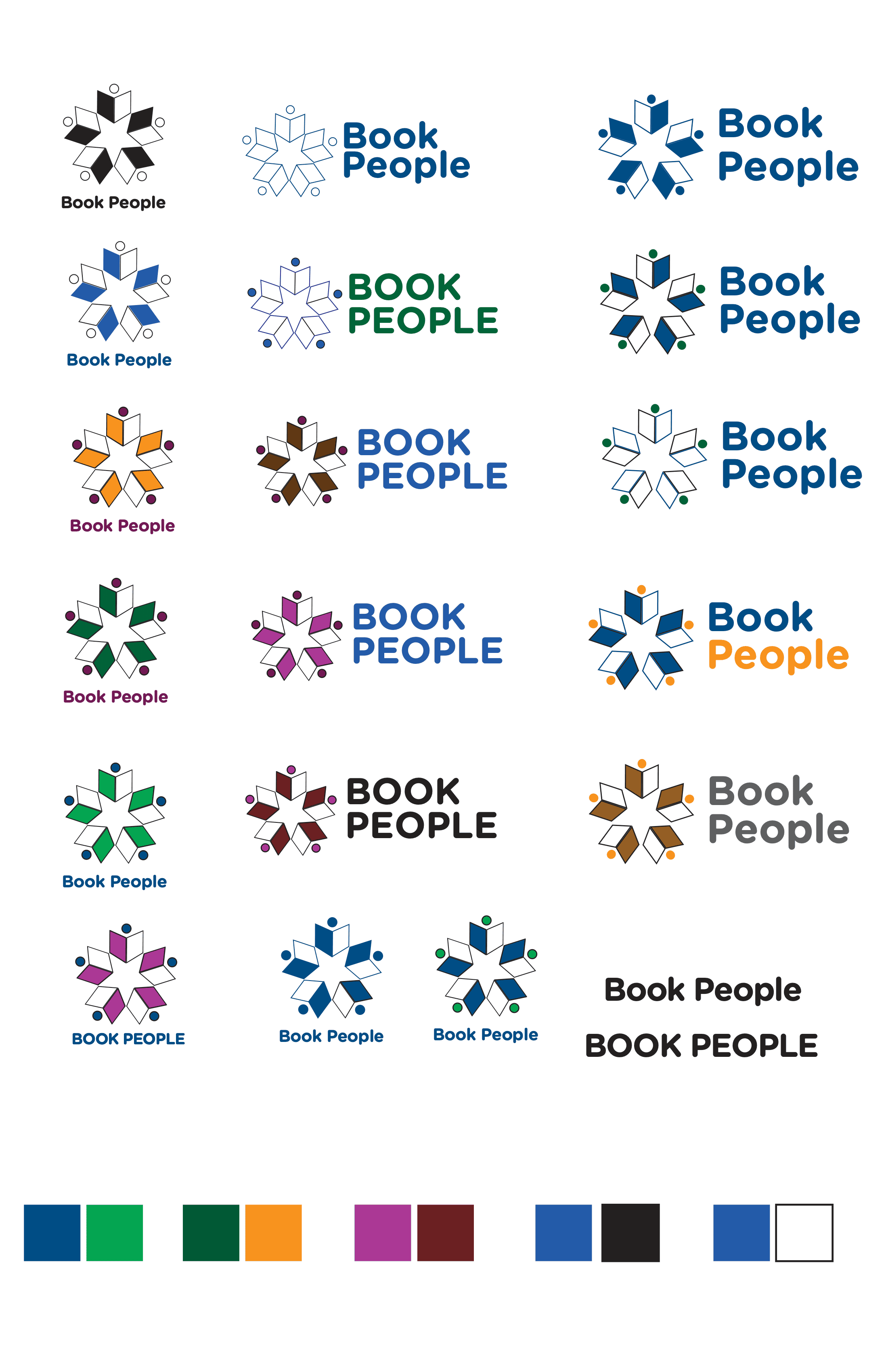
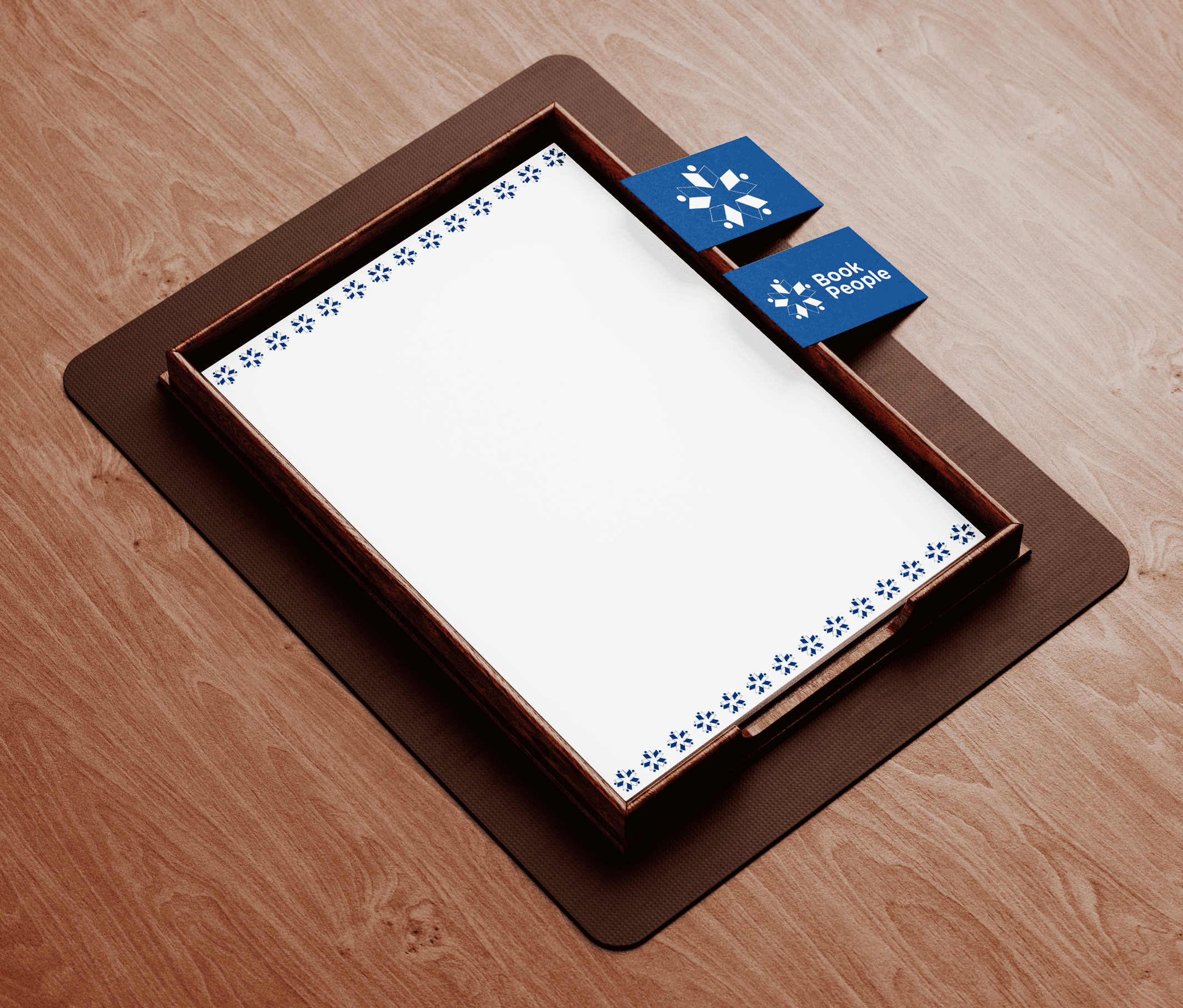
I'm proud of the final Book People logo. It's easy to use on many platforms and items, but still full of meaning. The design weaves together modern lines with a nod to local roots, the star shape signals the lone star of Texas, while the books and people show the store's welcoming community and love of reading. Each detail helps tell Book People's story and makes the brand feel at home in Austin.
