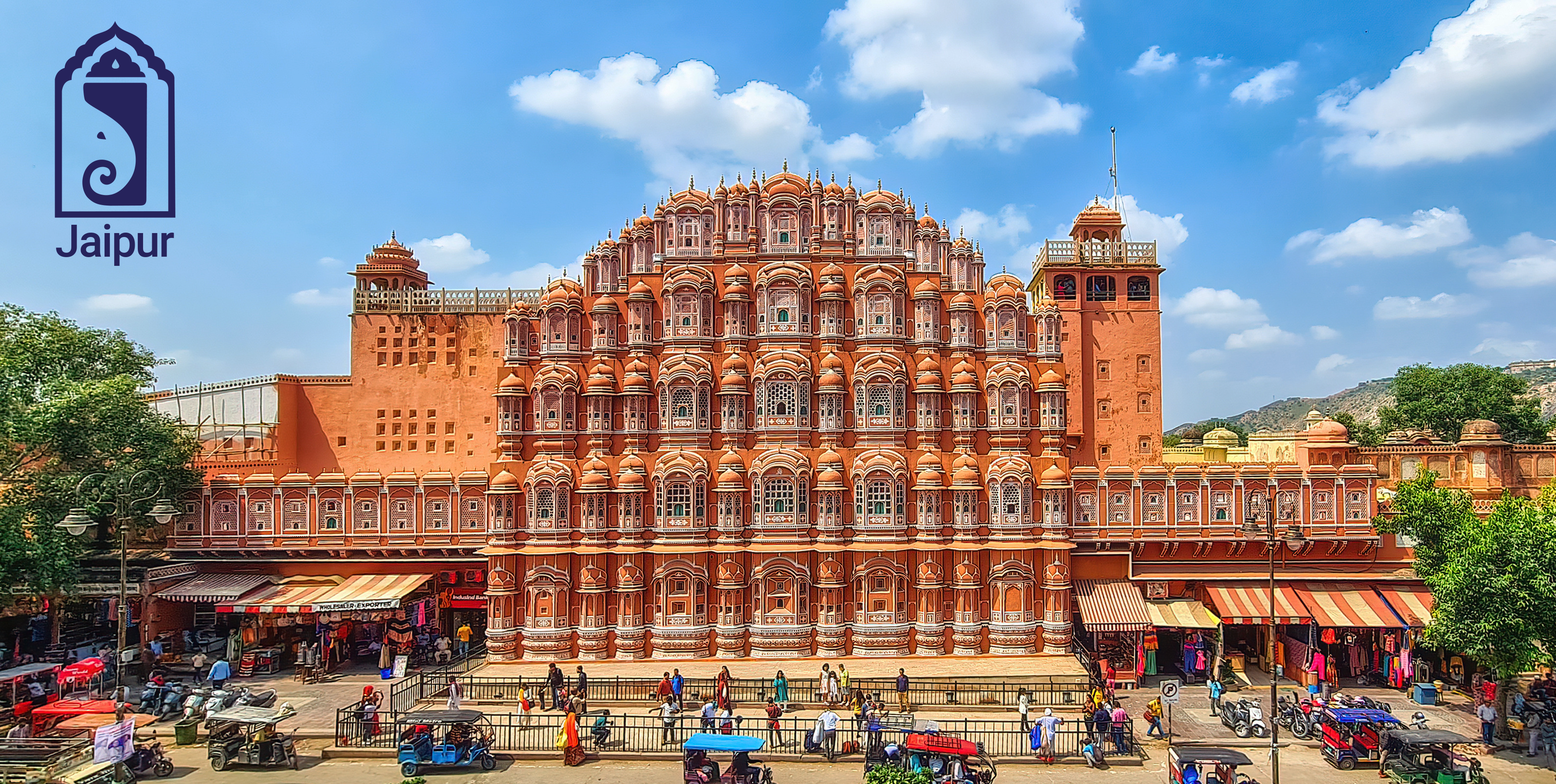
Jaipur City Branding
Branding the Pink City: A Multi-Channel Campaign for Jaipur
Project Summary
A project doesn't get much more personal than this. Branding the city where I was born and raised was an honor. My campaign for the "Pink City" is not just about promoting a destination; it's about celebrating a part of myself.
The goal was to position Jaipur as a contemporary cultural icon, where royal heritage meets vibrant, artistic modern design. The campaign spanned key touchpoints including a logo, brochure, a responsive website, and social media posts. This multi-channel campaign was built to attract a new generation of travelers and locals alike, emphasizing authenticity, craftsmanship, visual sophistication, and global appeal.
Research and Discovery
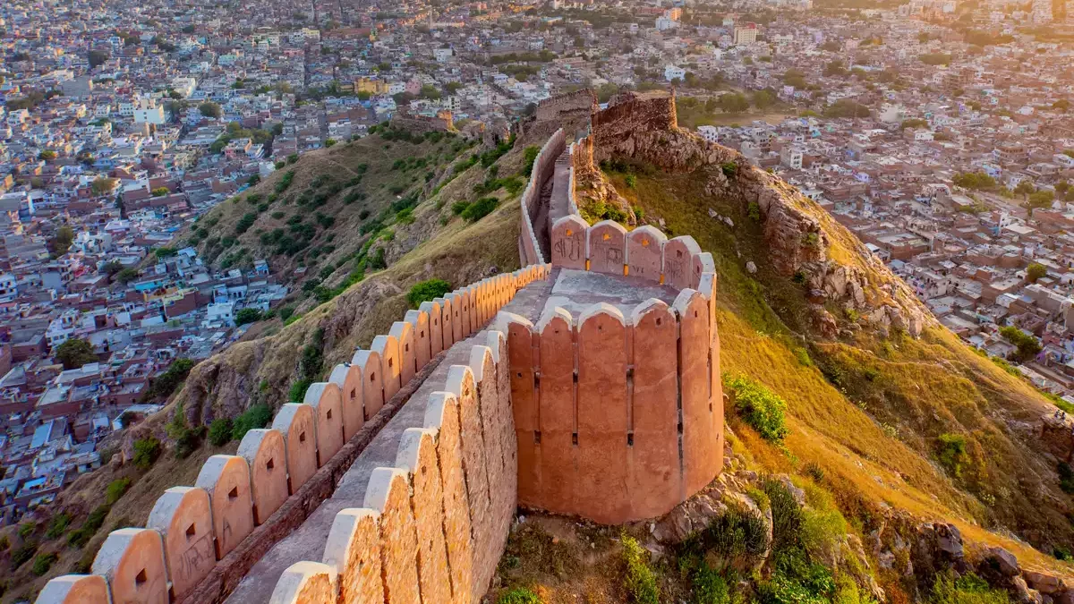
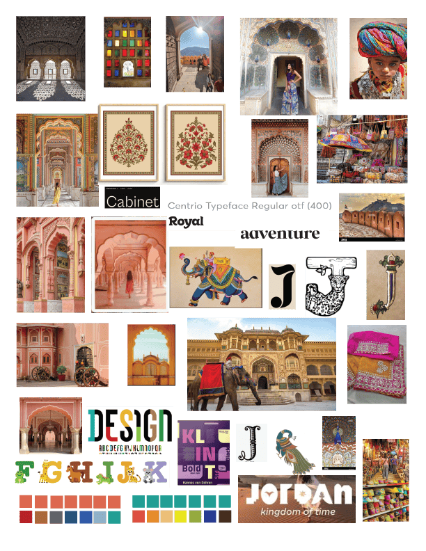
Research for this campaign focused on Jaipur's balance of heritage and modernity, starting with its planned grid, iconic pink façades, and regal architecture. These elements inspired a visual language built around symmetry, vibrancy, and majesty. Exploring geometric motifs and local iconography, especially latticework and elephants, revealed how royal influences inform everyday life and celebrations.
Current traveler insights show a preference for destinations blending authenticity and refinement. Guided by these findings, the campaign unites Jaipur's timeless legacy with its lively, contemporary energy, creating a cohesive identity that feels equally classic and fresh.
Mood Board
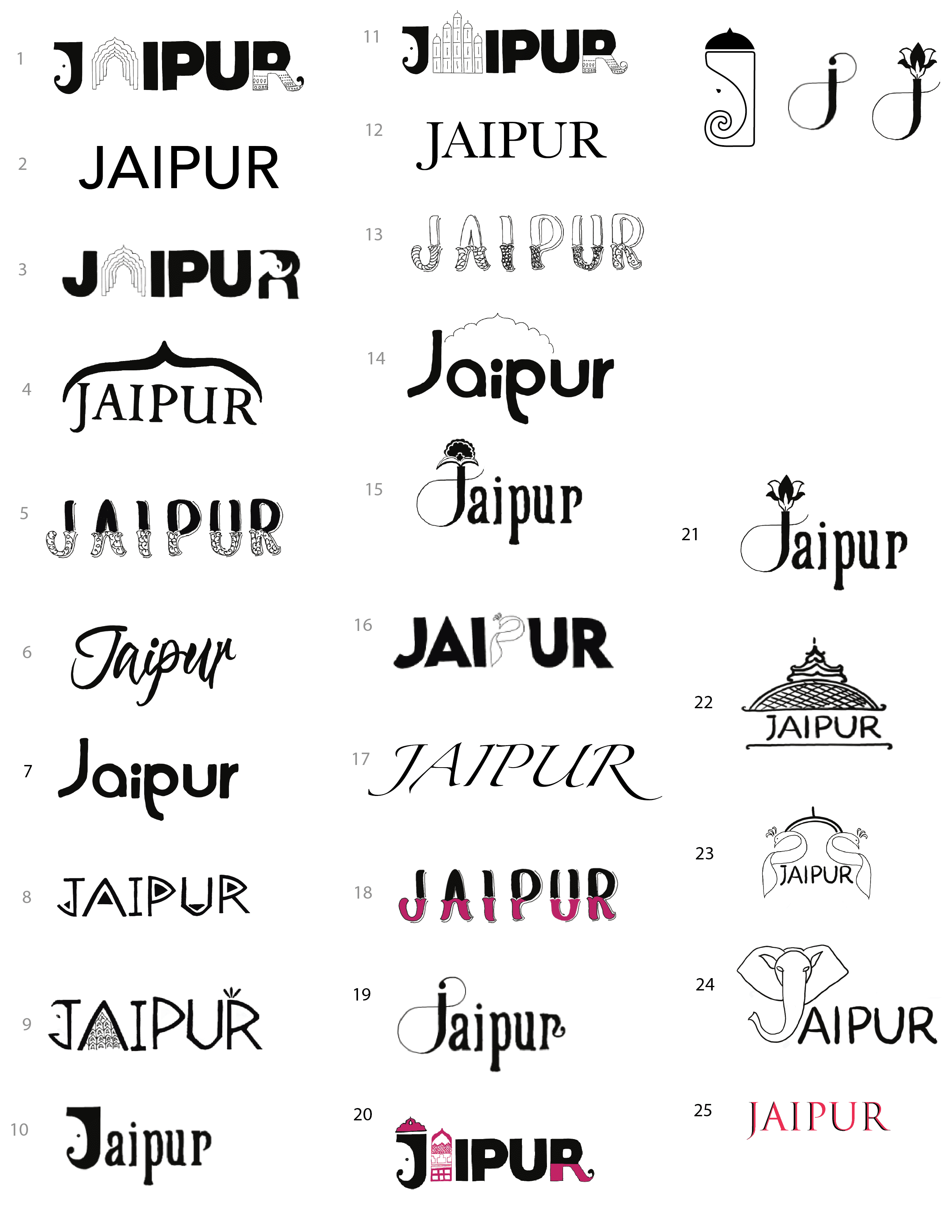
Sketches
Creative Challenge
The challenge was to distill Jaipur's rich heritage and vibrant culture into a cohesive identity that appeals to both modern travelers and traditional admirers. With so many symbolic elements like arches, elephants, textiles, and geometric patterns, the task was to curate and simplify without losing authenticity. Balancing grandeur with approachability and timelessness with energy was key to creating a refined, vibrant campaign that bridges Jaipur's royal legacy with its contemporary spirit.
Final Design
Variations and Elements


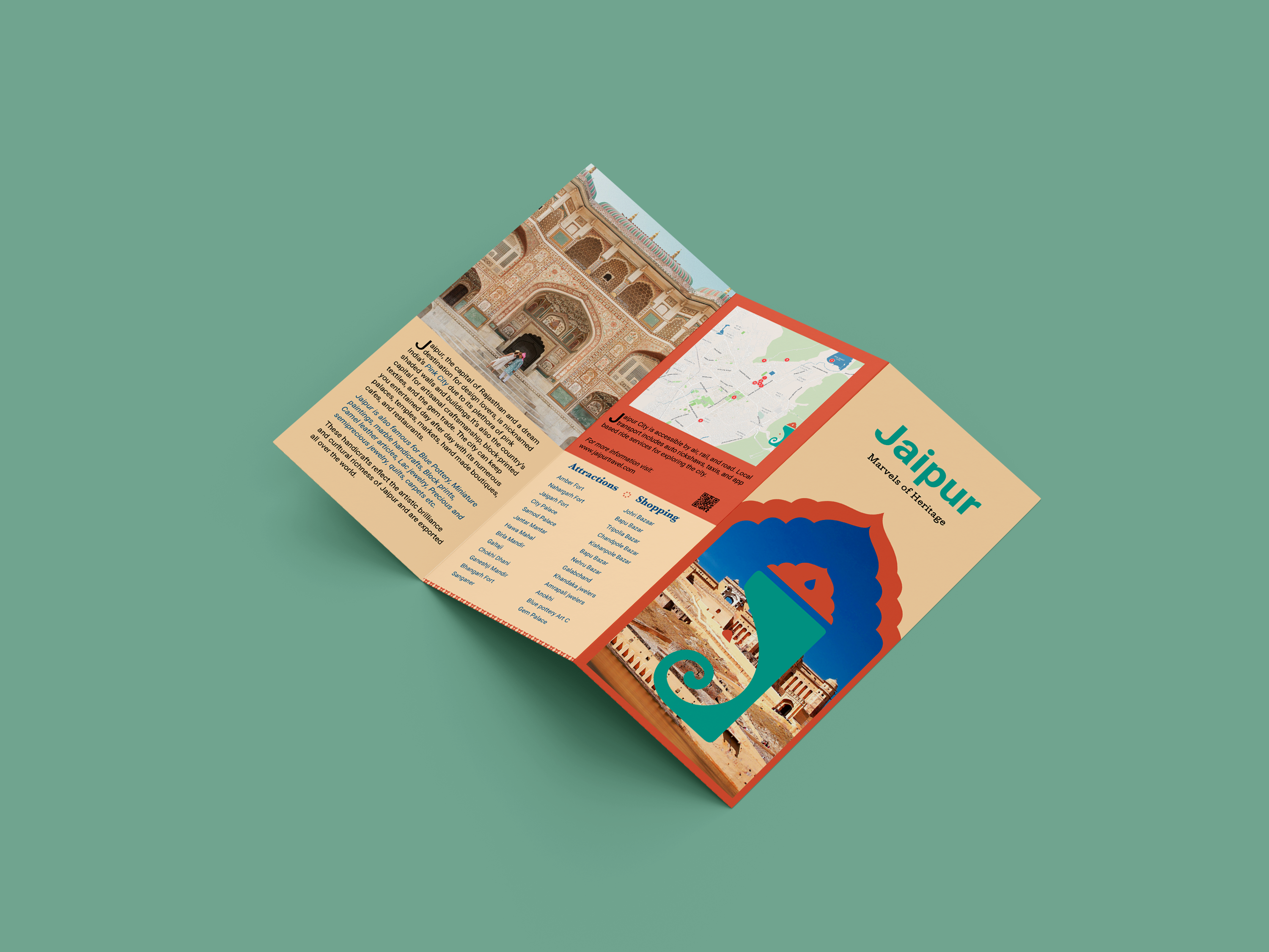
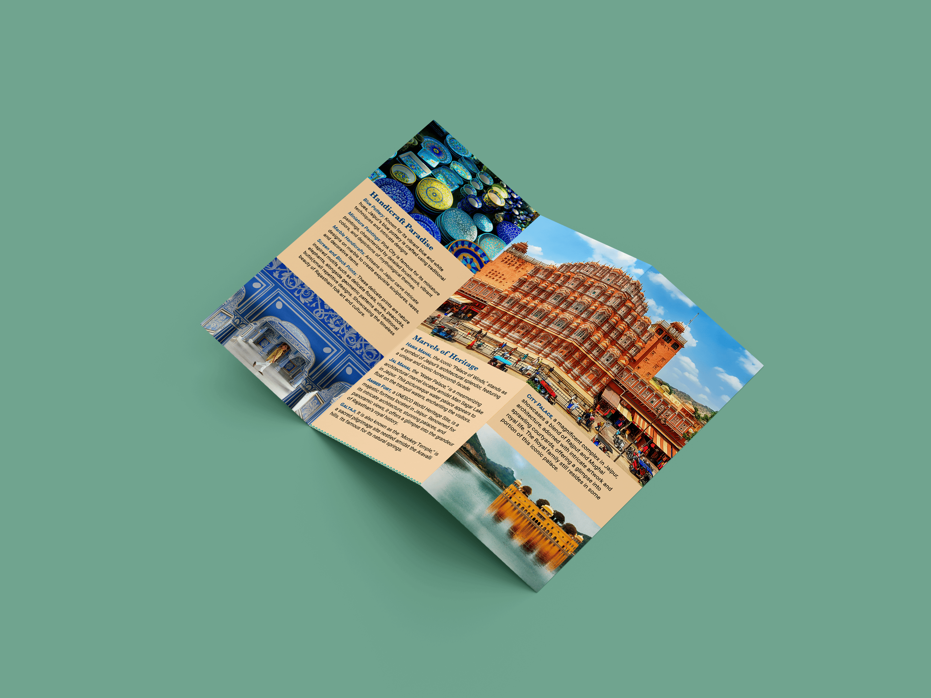
Brochure
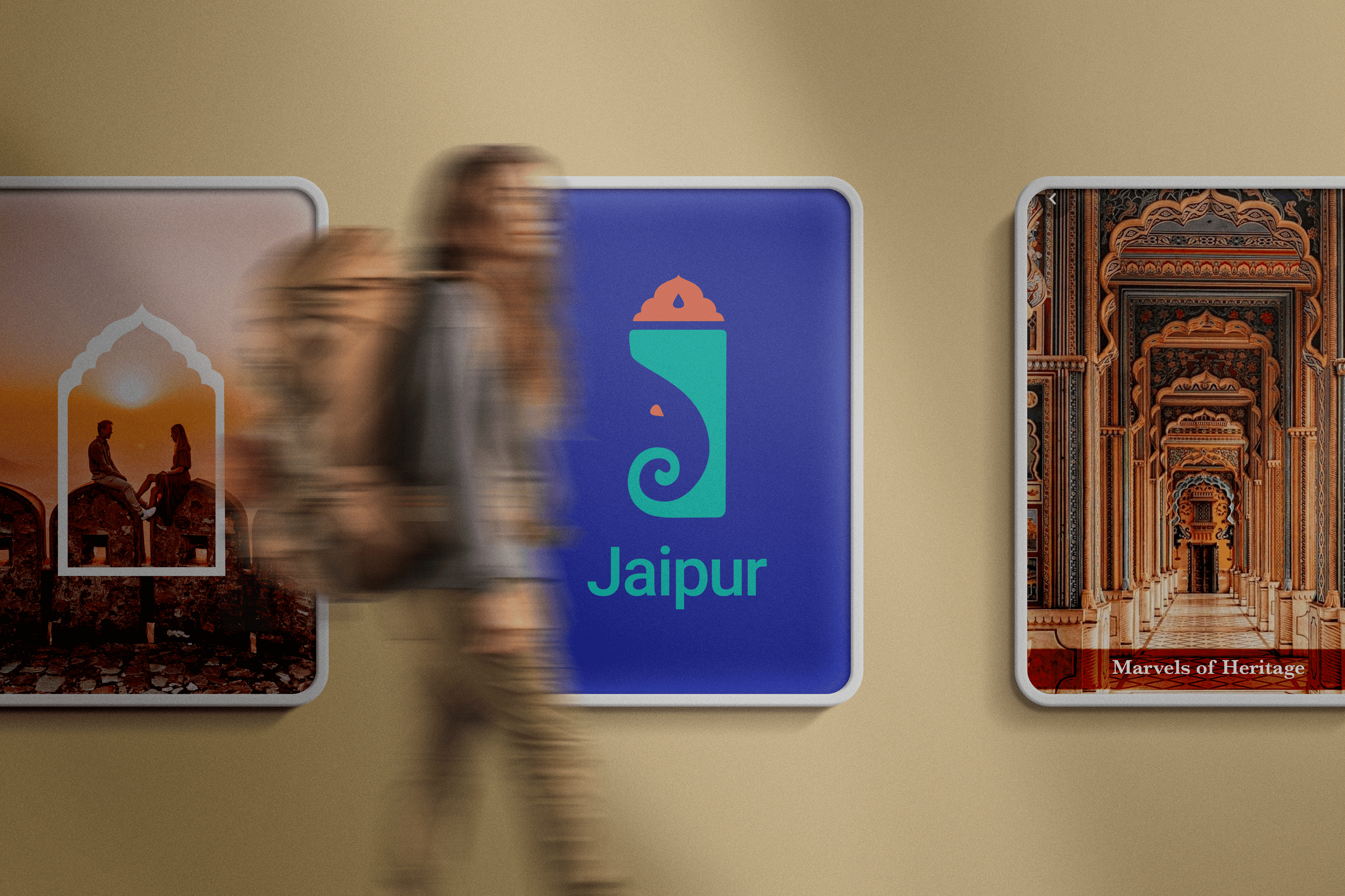
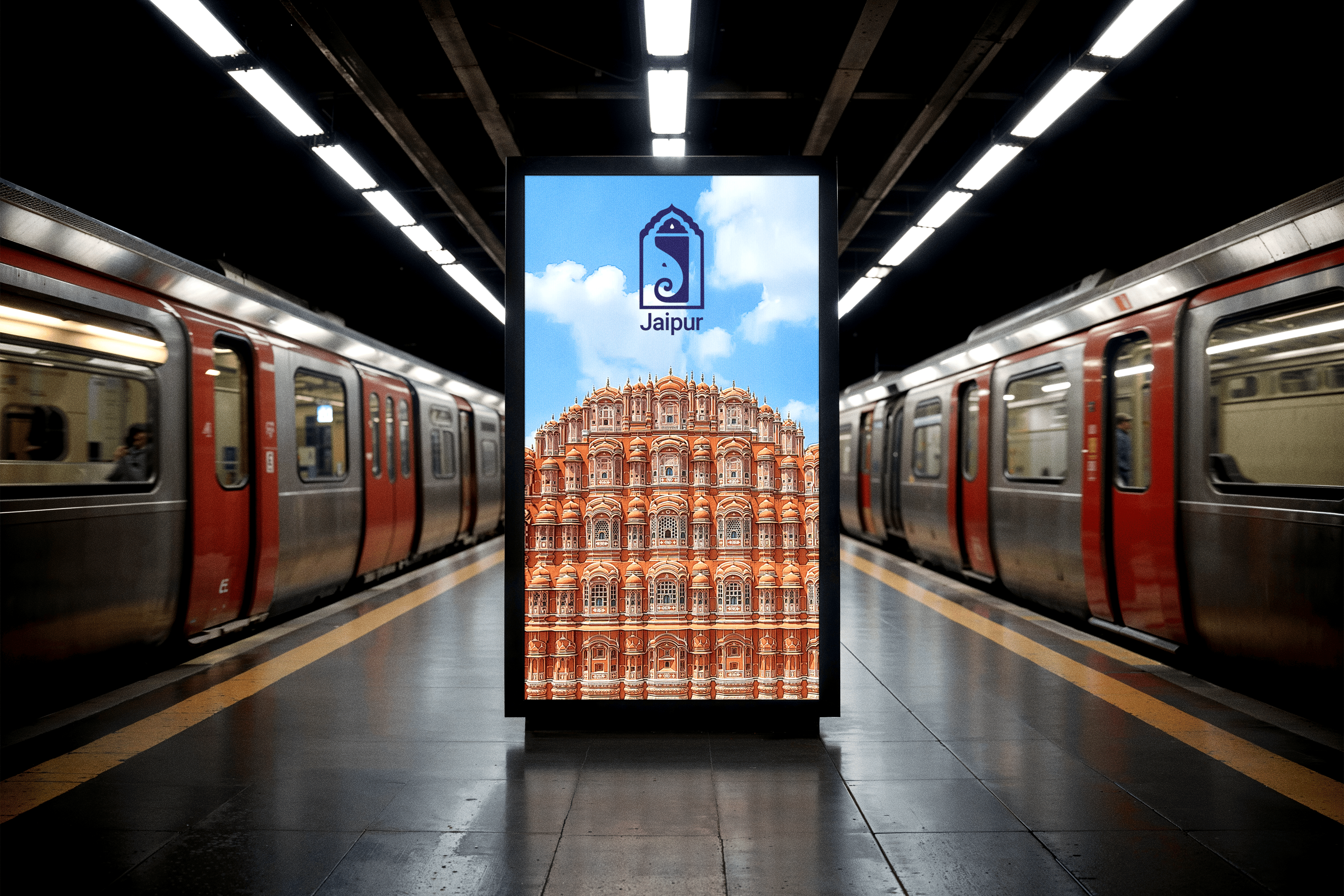
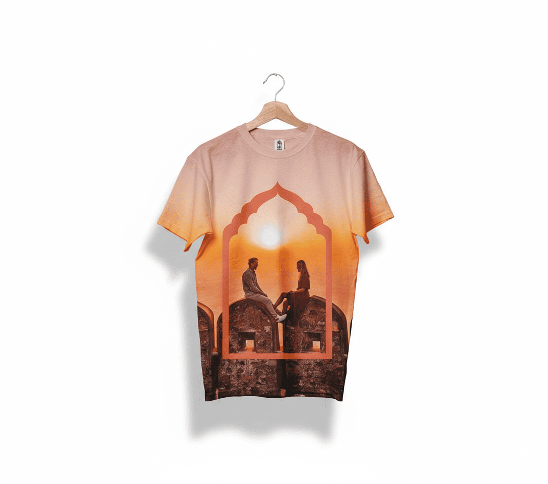
Brand Applications


Project Reflections
This campaign successfully captures Jaipur's unique blend of majestic heritage and vibrant modernity, celebrating its colorful spirit and cultural depth. Simplifying Jaipur's rich visual language while preserving its essence allowed the brand to feel timeless yet fresh, resonating with diverse travelers seeking both authenticity, elegance, and a distinct personality.
The project reinforced the importance of thoughtful curation and intentional storytelling, choosing motifs and colors that tell a clear, cohesive story with emotional resonance. The final campaign invites audiences to see Jaipur as both timeless and dynamic, celebrating its architectural beauty and cultural vitality while inspiring curiosity and connection.