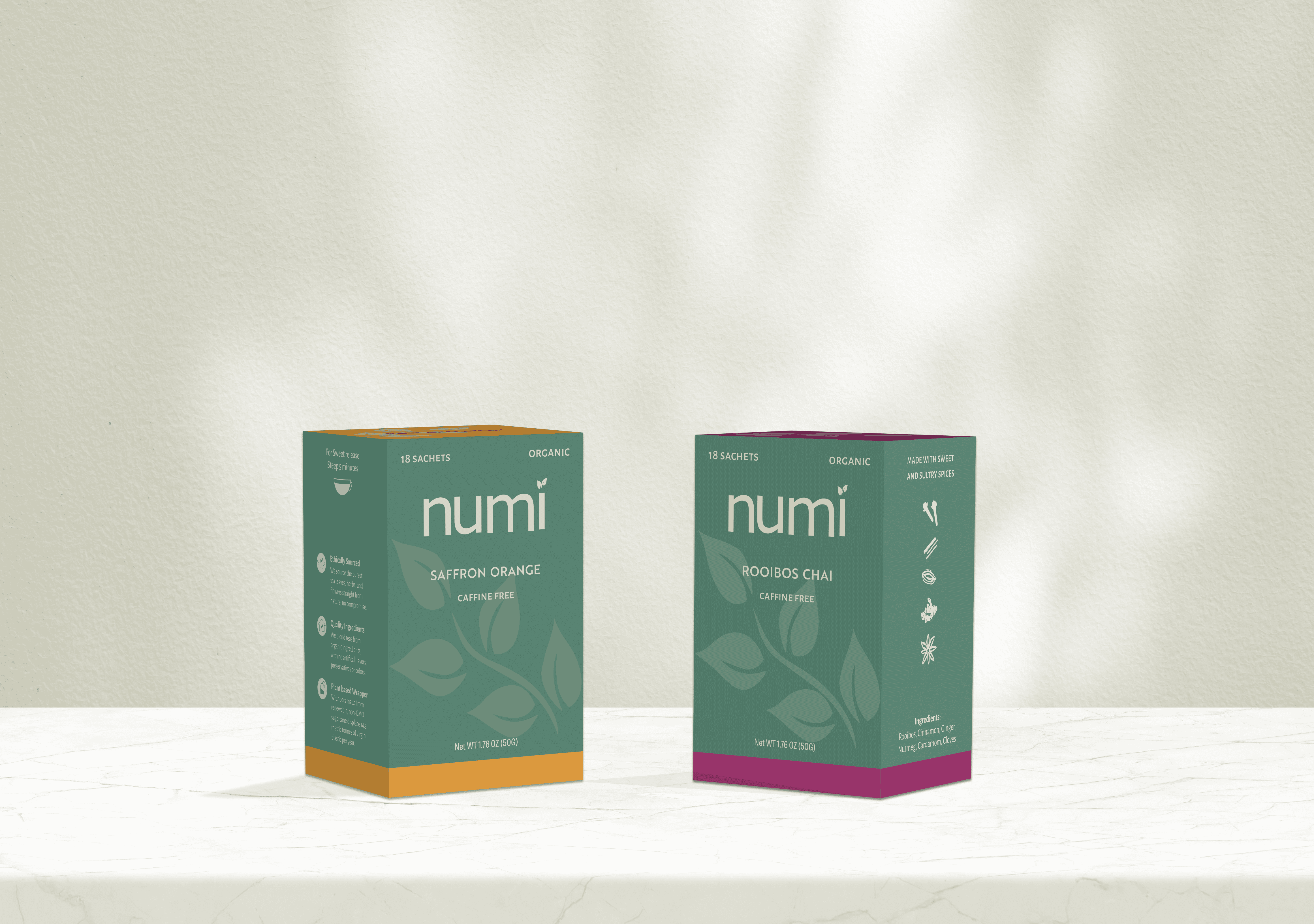
Numi Tea Packaging
Redesigning the Packaging for Numi Organic Teas
Project Summary
This project focused on redesigning the packaging for Numi Organic Teas to better reflect the brand's natural and organic qualities. The goal was to create a clean, modern system that communicates transparency and trust while appealing to health-conscious consumers.
Research and Discovery
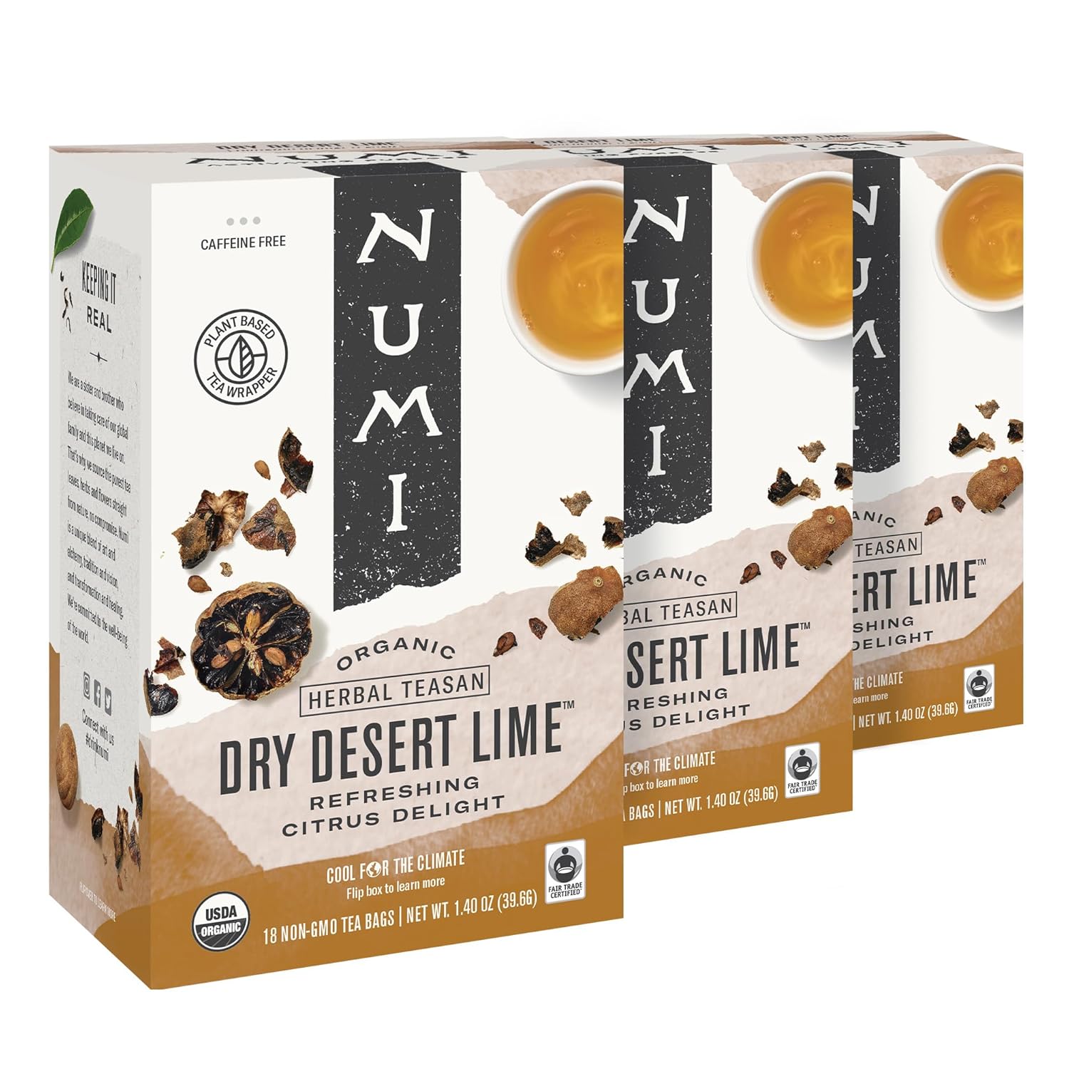
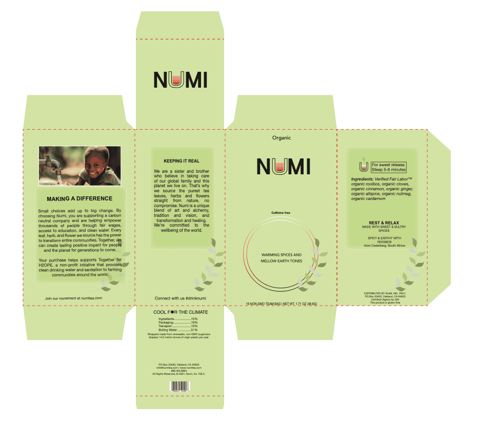
The research process began with exploring existing tea brands and studying how design choices shape perception. I examined a range of packaging styles to understand how color, texture, and layout communicate qualities like purity, warmth, and authenticity. While many premium teas leaned toward ornate or luxurious aesthetics, Numi's identity felt more rooted in nature and focused on wellness.
Learning about Numi's origins and its global tea influences deepened my appreciation for its cultural and ethnic diversity. This understanding guided the visual direction toward a design language that feels both natural and inclusive. The goal was to create packaging that feels calm, honest, and universally welcoming.
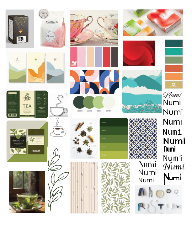
Mood Board
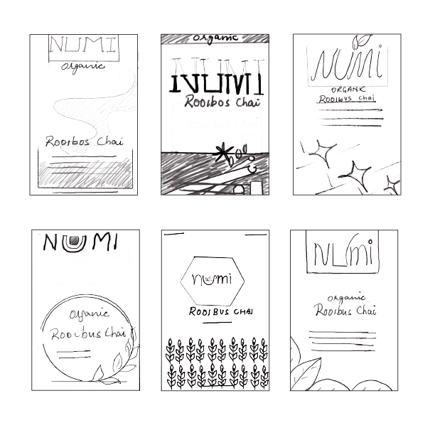
Sketches

Creative Challenge
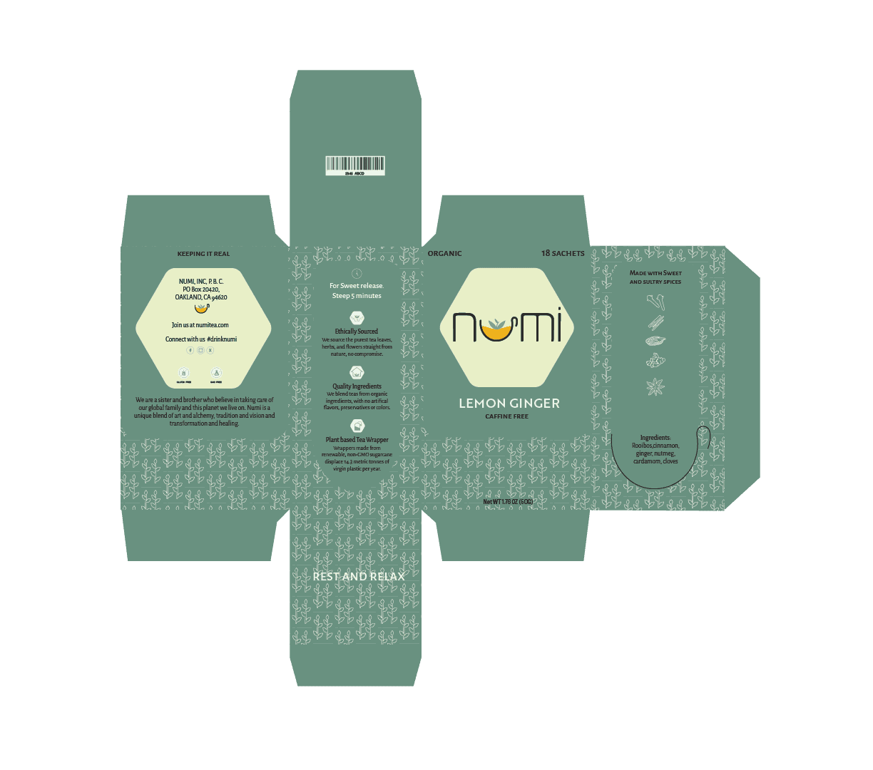
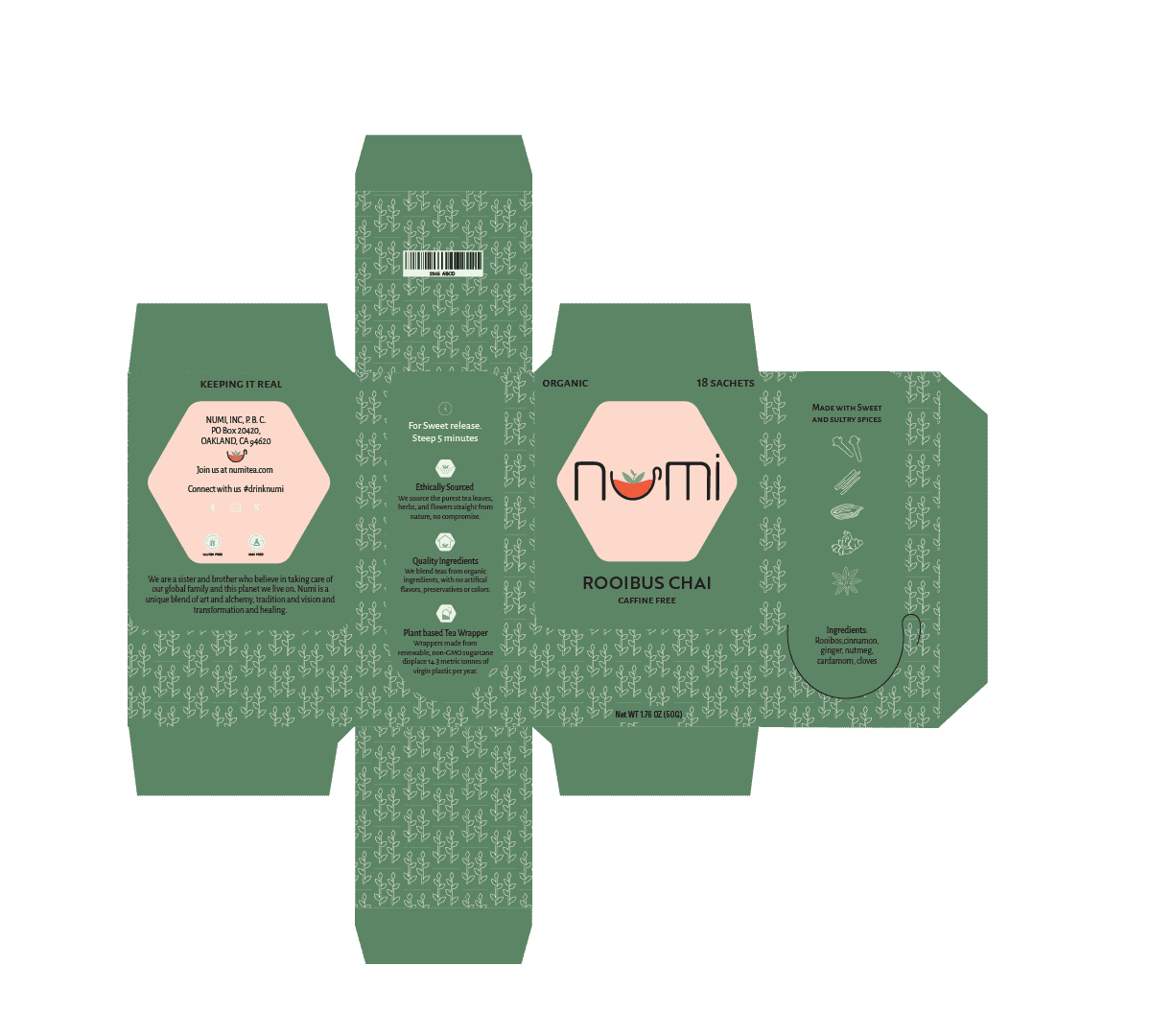
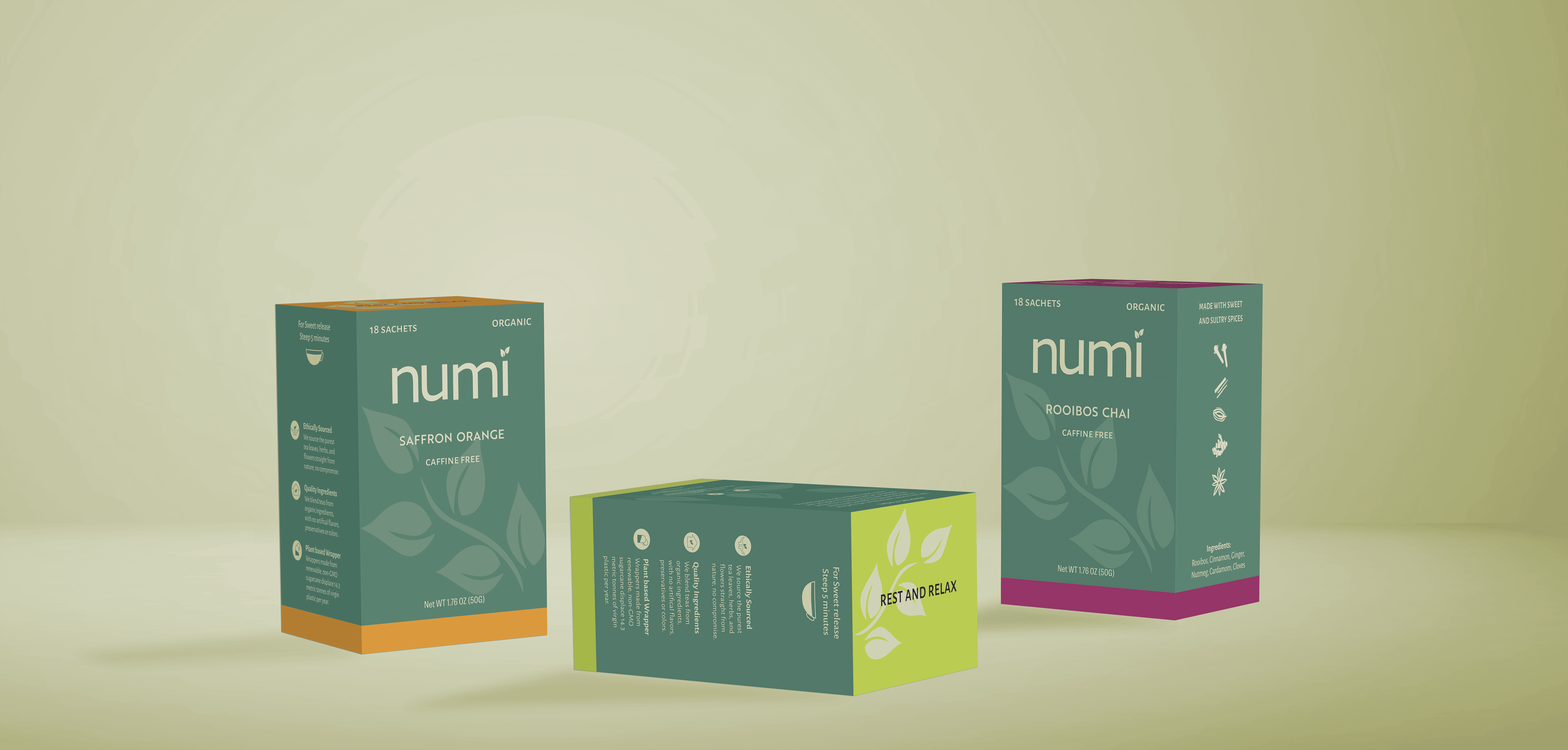
The key challenge was creating a cohesive brand that differentiates between flavors while maintaining a strong, unified shelf presence. Each tea needed its own distinct personality, expressed through bright, uplifting accent colors, yet the overall design had to remain grounded and elegant. Balancing vibrancy with restraint meant carefully pairing bold hues with soft greens, clean typography, and ample white space.
Digital Explorations
Final Design


Brand Applications
Project Reflections
This project taught me the power of minimal, color-driven design in creating clarity and connection. I learned how to use bright accent colors to draw attention while maintaining a sense of calm and natural balance true to Numi's identity. Incorporating flat leaves, ingredient icons, and concise attribute lists helped me make the product's benefits clear at a glance.
Working within a cohesive yet flexible system pushed me to balance vibrancy with restraint, ensuring each flavor felt distinct but still part of a unified family. The process deepened my understanding of how color, structure, and simplicity can express both practicality and brand ethos, capturing the essence of rest, wellness, and sustainability that defines Numi.
